
How to make text easier to read in iOS 26
If you have upgraded to iOS 26 and iPadOS 26, you’ll undoubtedly notice Apple’s new Liquid Glass design. This is the first major update to the iPhone appearance since iOS 7 did away with skeuomorphisms twelve years ago, so it’s understandable that many people find this new look shocking. I’m a big fan of the new layered translucent glass look, but many people who have vision trouble or prefer fewer distractions may want to tone it down a bit. Luckily, it’s easy to do.
Head to the Settings app > Accessibility > Display & Text Size. Then turn on “Reduce Transparency”. This gets rid of all translucency so that text is easier to read on some backgrounds. For an extra kick of visability, you can also enable “Increase Contrast”, which puts solid borders around all elements so that you can more easily distinguish buttons and dividers.
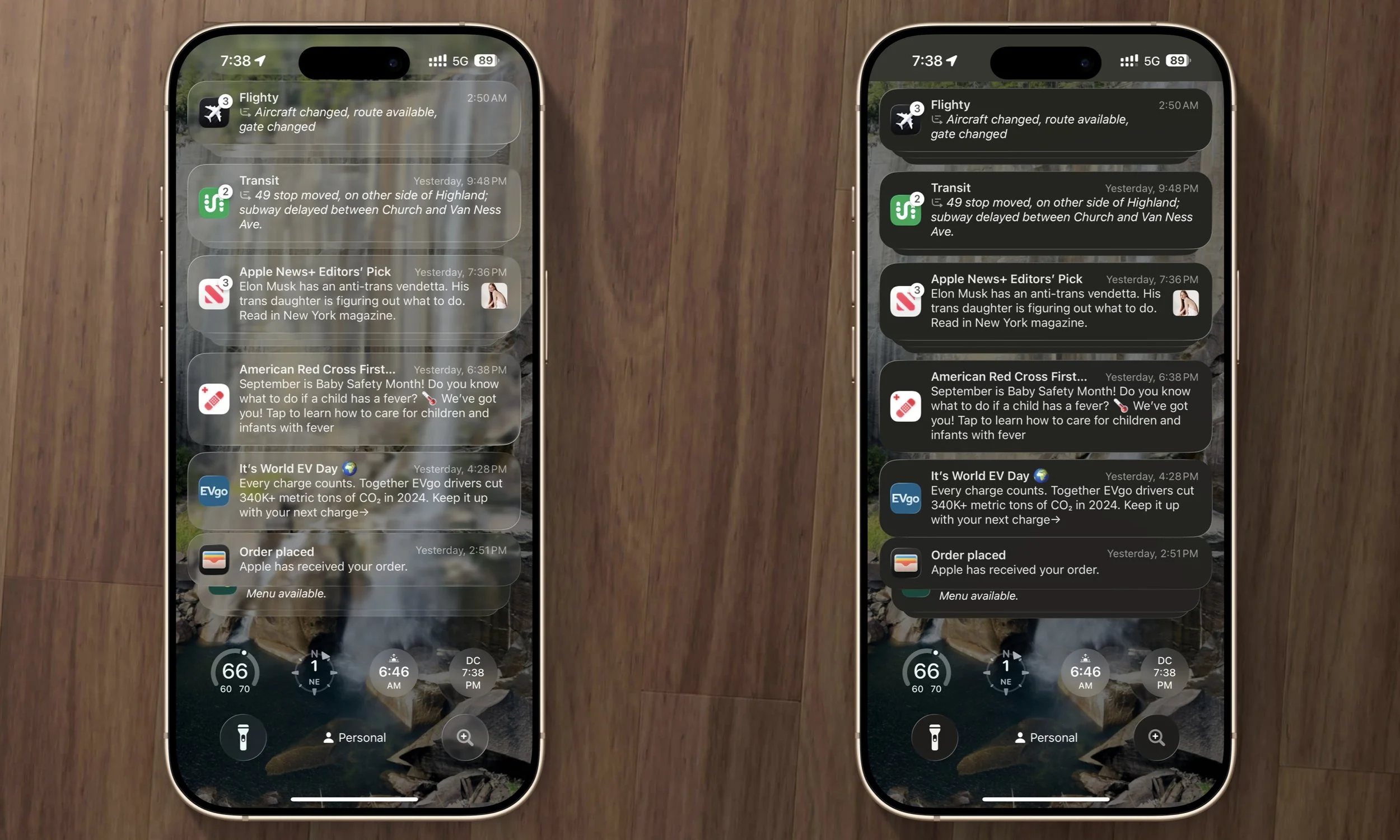
Left: default Liquid Glass
Right: “Reduce Transparency” enabled
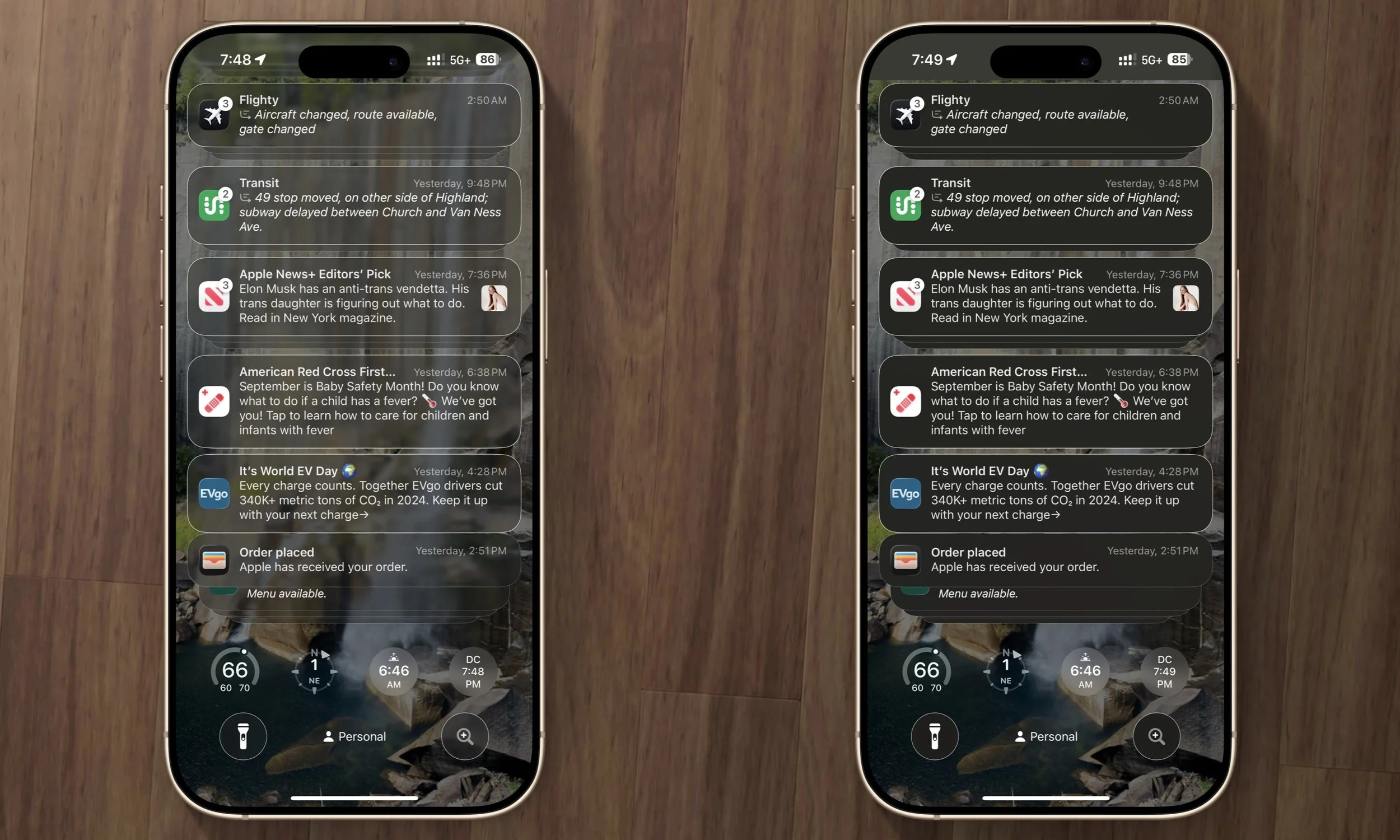
Left: “Increase Contrast” enabled
Right: Both “Increase Contrast” and “Reduce Transparency” enabled