


When Liquid Glass was released with iOS 26, many people complained that it made your devices more difficult to read. In answer to that, iOS 27 gives you a slider to add more tint. You can also keep using accessibility settings that make the screen more comfortable.
Find the Liquid Glass slider on iPhone
In iOS 27, open Settings > Appearance > Liquid Glass. Move the slider right for more tint or left for a clearer look. Apple’s iPhone display guide documents the new control.
Try a small change, then return to an app you use often. Look at the buttons and text over the background, not only the slider’s preview. There’s no reason to choose the most transparent appearance if you find another position more comfortable.
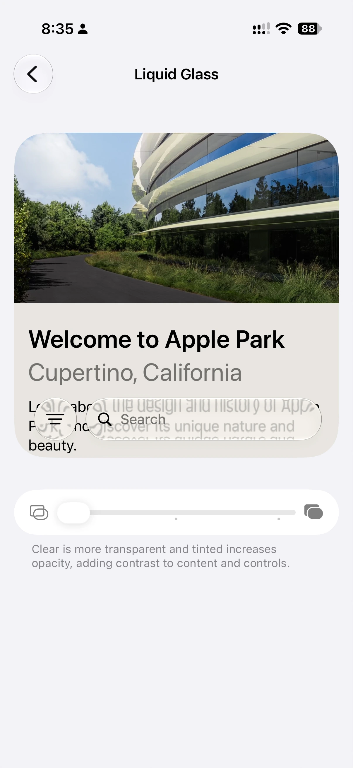
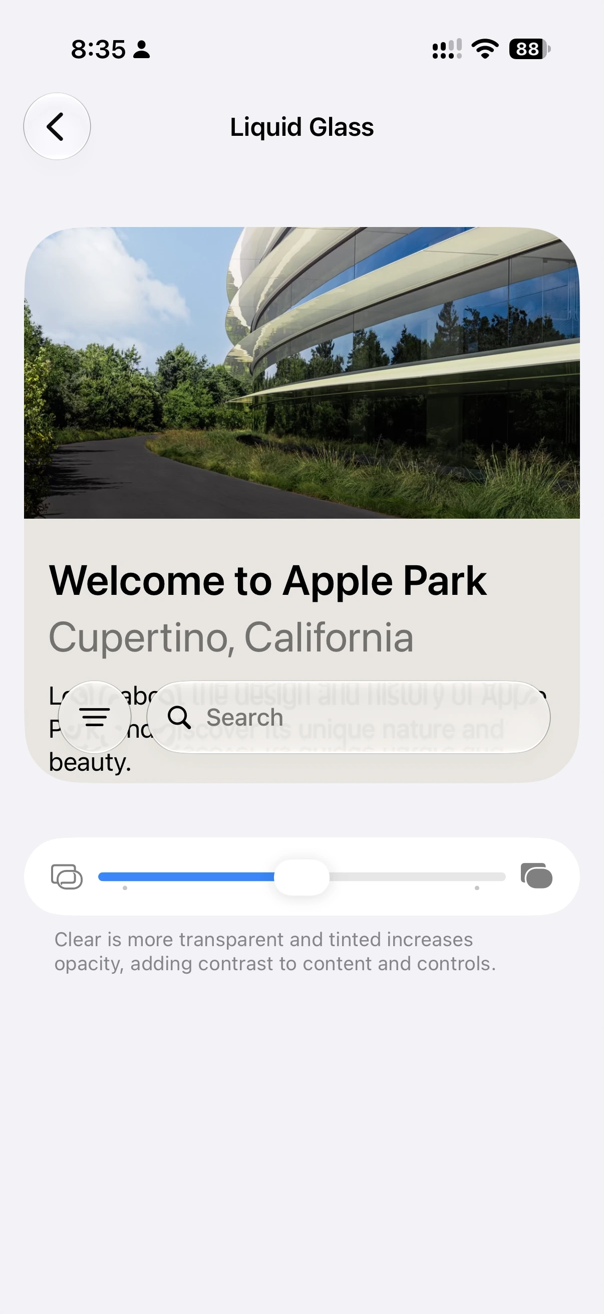
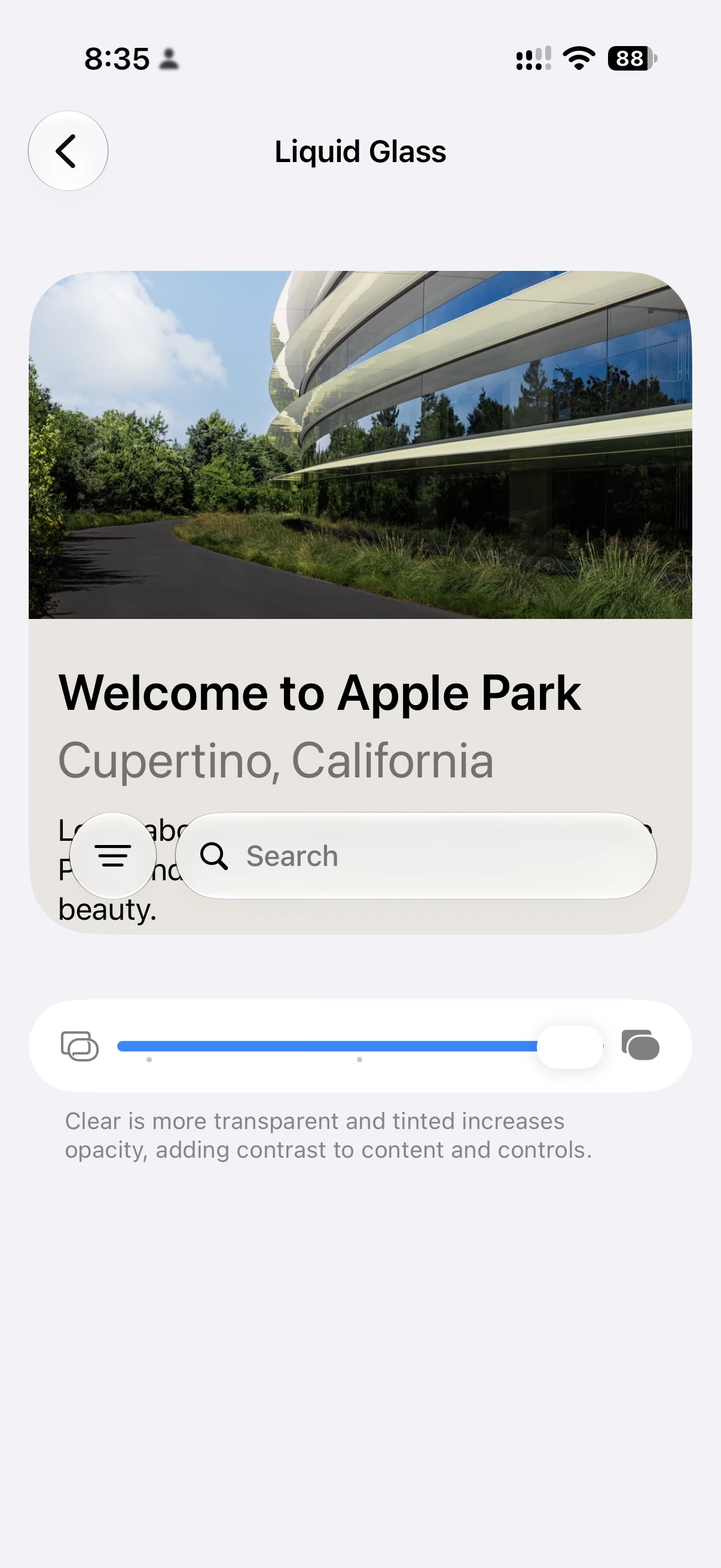
If your phone still runs iOS 26, the setting is in Settings > Display & Brightness > Liquid Glass instead. That version offers Clear and Tinted, rather than the continuous slider. Apple describes Tinted as adding opacity and contrast in its iOS 26 instructions.
If the slider won’t let you change it
Apple says the iPhone Liquid Glass control requires Reduce Transparency and Increase Contrast to be off. You can find those options in Settings > Accessibility > Display & Text Size, as listed in Apple’s display accessibility instructions.
That doesn’t mean you should turn them off. If your existing settings help you read, I’d keep them. Personalizing the glass effect is optional, and a decorative preference isn’t a reason to give up a useful accessibility adjustment.
If letters are too small rather than hard to distinguish from the background, consider Text Size or Bold Text under Settings > Appearance. Changing tint and changing text size address different problems.
What to change on Mac
On macOS 27, open the Apple menu > System Settings > Appearance and look for the Liquid Glass slider. Apple’s Appearance guide describes the slider in terms of app icons. I wouldn’t assume it changes every toolbar or every third-party app in exactly the same way.
For a more direct readability adjustment, open System Settings > Accessibility > Display. Reduce transparency replaces some transparent backgrounds with solid ones. Increase contrast strengthens boundaries around items such as buttons and boxes. Apple documents both in its Mac display accessibility guide.
Make one change at a time and compare the apps you actually use. Note your original settings so you can return to them. The useful result is a screen you can read comfortably, whether that comes from more tint, stronger boundaries, larger text, or a combination.
Further reading


If your iPhone or Mac is still uncomfortable to read, I can help you compare the display and accessibility settings in one-on-one computer tutoring. You can book a session to find a setup that works for you.